
Swara
MYP system improvement
Time Line: February - May 2026 (16weeks)
Role: UX Designer / UX researcher
Note: The materials referenced in this case study are from a proprietary work system (MYP) and are used with explicit permission from my employer, solely for the purpose of showcasing UX process and design thinking. No confidential business data, internal metrics, or proprietary code has been disclosed.
Background
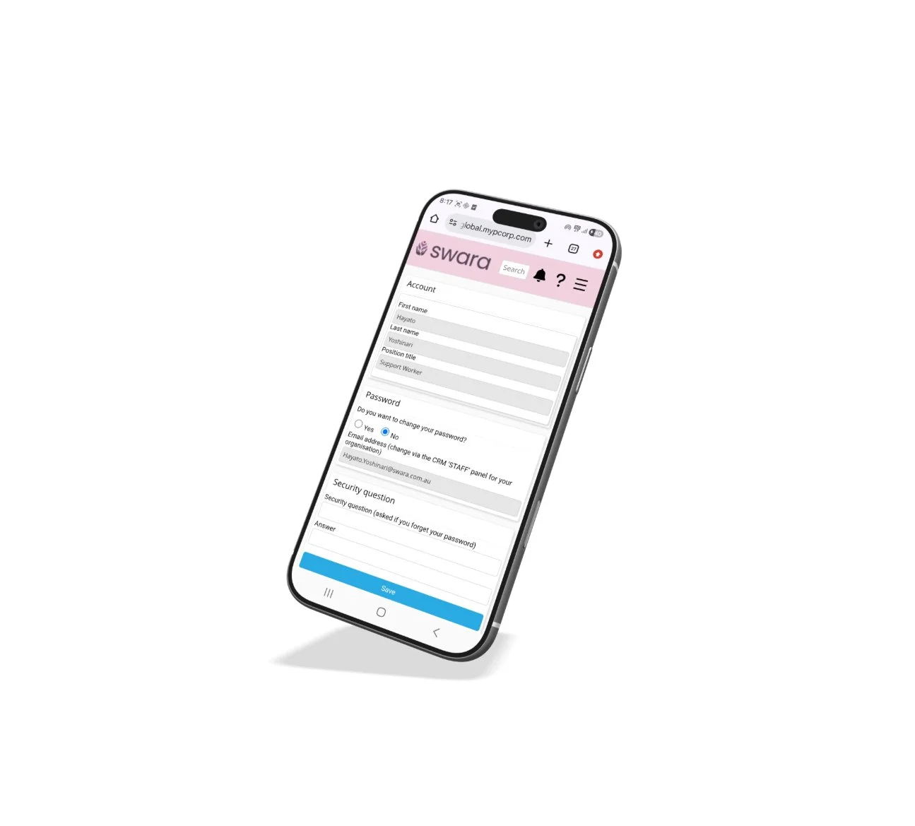
Since completing my grad certificate in UX design, I've been building out my portfolio. I decided to start with a case study from my current workplace, Swara. It's a not-for-profit disability support provider that uses the MYP system to manage employees and clients.
The system looks simple on the surface, but it's more complex than it appears. Colleagues regularly mentioned how difficult it was to use, which made it the perfect starting point.
Overview
The goal of this project was to identify the usability issues impacting staff most in their day-to-day work, and determine which problems to prioritise for improvement. A better system means staff can deliver higher quality care. And when the standard of service goes up, so does Swara's ability to attract and retain more clients, which supports the growth of the organisation.
Research & Discovery
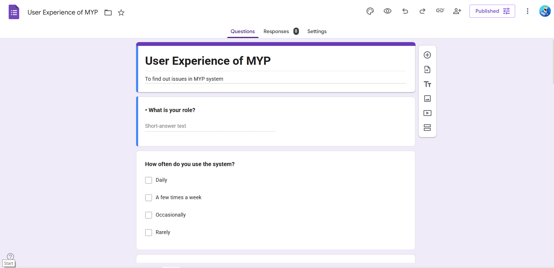
During the initial research phase, I gathered insights from two key user groups. There were 4 office administrators and 4 support workers, 8 participants in total. Since finding time during work hours was tricky, a UX questionnaire proved to be the best approach, allowing everyone to respond in their own time. To streamline this process, I used Google Apps Script alongside Claude AI to build and deploy the survey as a Google Form, which made it quick to create, distribute, and collect responses at scale.
On top of that, one of my admin colleagues gathered the rest of the admin team for a quick brainstorm, where they listed out their everyday pain points with the MYP system and passed the findings back to me. This added useful context to the questionnaire results.
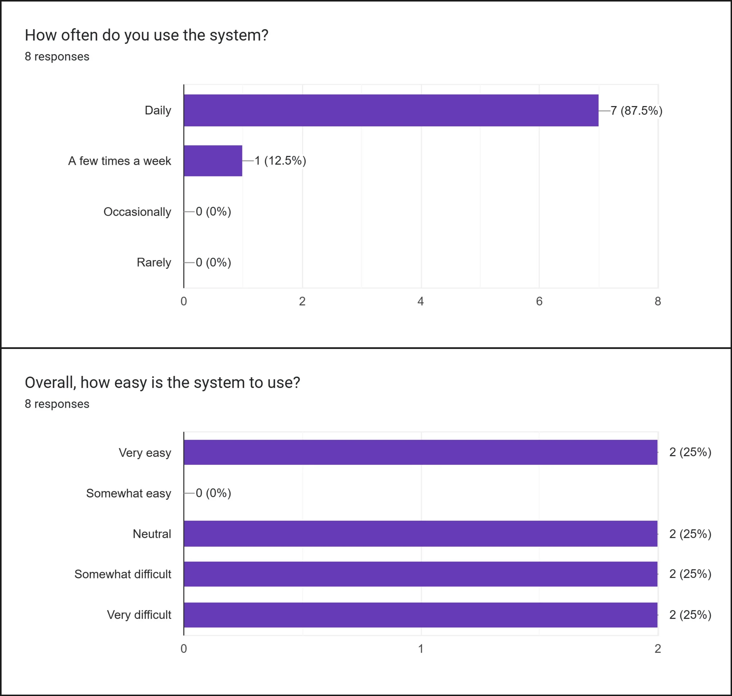
Research shows
75% of respondents found the system difficult or neutral to use, and 87% use it every single day. This means these frustrations are not occasional. They are a daily reality.
Frustration of using MYP
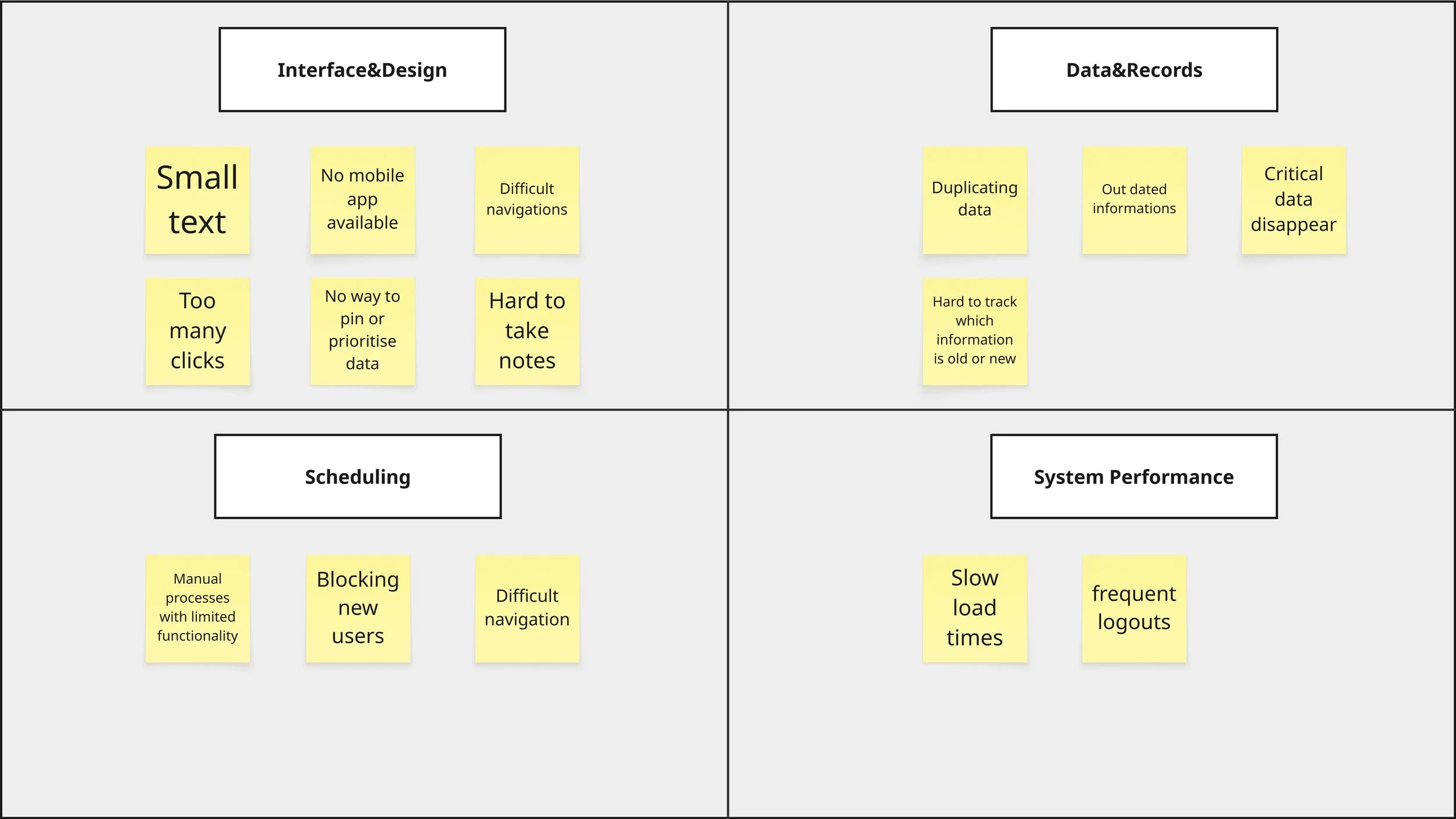
I used an affinity map to organise the findings and identify 4 key problem areas within the MYP system.
Interface & design
Scheduling
Data & recording
System performance
Defining the Problem
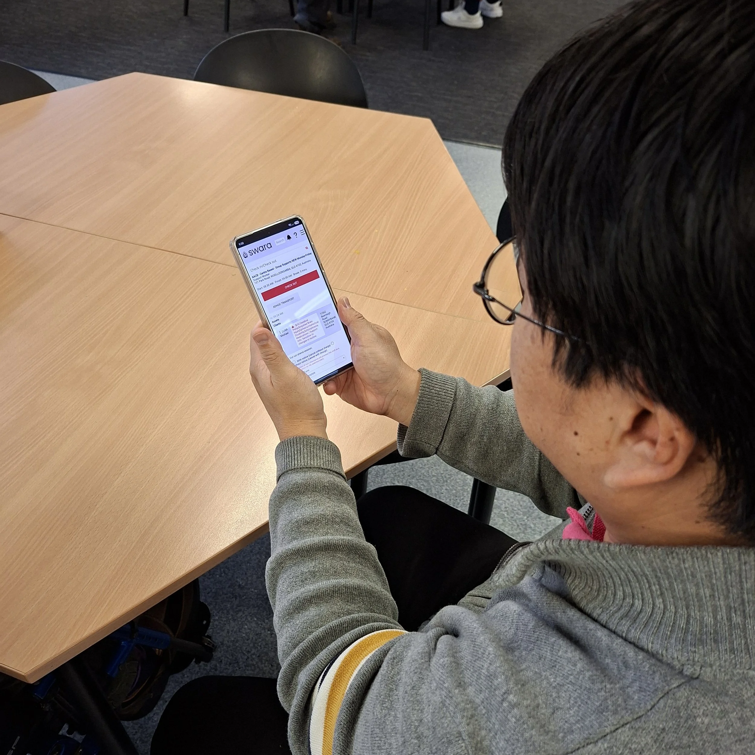
Support workers are unable to do their jobs efficiently because the MYP system is slow, hard to navigate, and requires too many steps. This is especially true for staff who need to submit multiple case notes in a single day, sometimes up to 5 or 6.
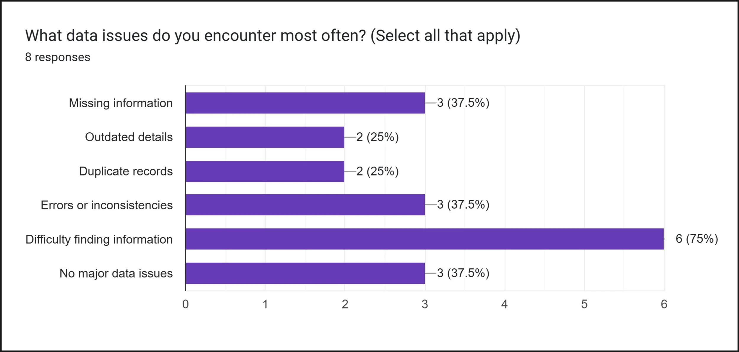
The data backs this up. 75% of respondents reported difficulty finding information, making it the single most common data issue across the entire team.
The support worker side of the system is more focused than the admin side. This makes it the right starting point.
Office admin issues and system performance problems are more complex and will be treated as a dedicated priority in a later phase.
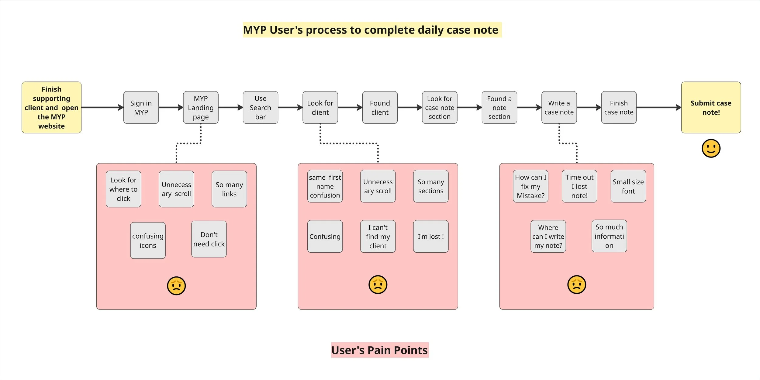
The Steps a Support Worker Takes to Complete a Daily Case Note
This diagram maps the steps a support worker takes to submit a single case note every day. It reveals multiple pain points where staff are likely to get lost, time out, or give up before completing the task.
Improvement Concepts
The concepts below were developed directly from the pain points reported by support workers during the research phase.
Reduce the number of clicks needed to reach the case note section
Add a clear menu shortcut so case notes are accessible from anywhere in the system
Add client profile photos to help staff quickly identify the right client
Introduce speech-to-text functionality for faster and easier note taking
Auto-save case notes to prevent data loss from unexpected logouts
Increase text size across the system for better readability
Simplify each page by reducing unnecessary links and information
Redesign the case note experience specifically for support workers — simpler, faster, and mobile friendly
Ensure client data is accessible and up to date for the admin team
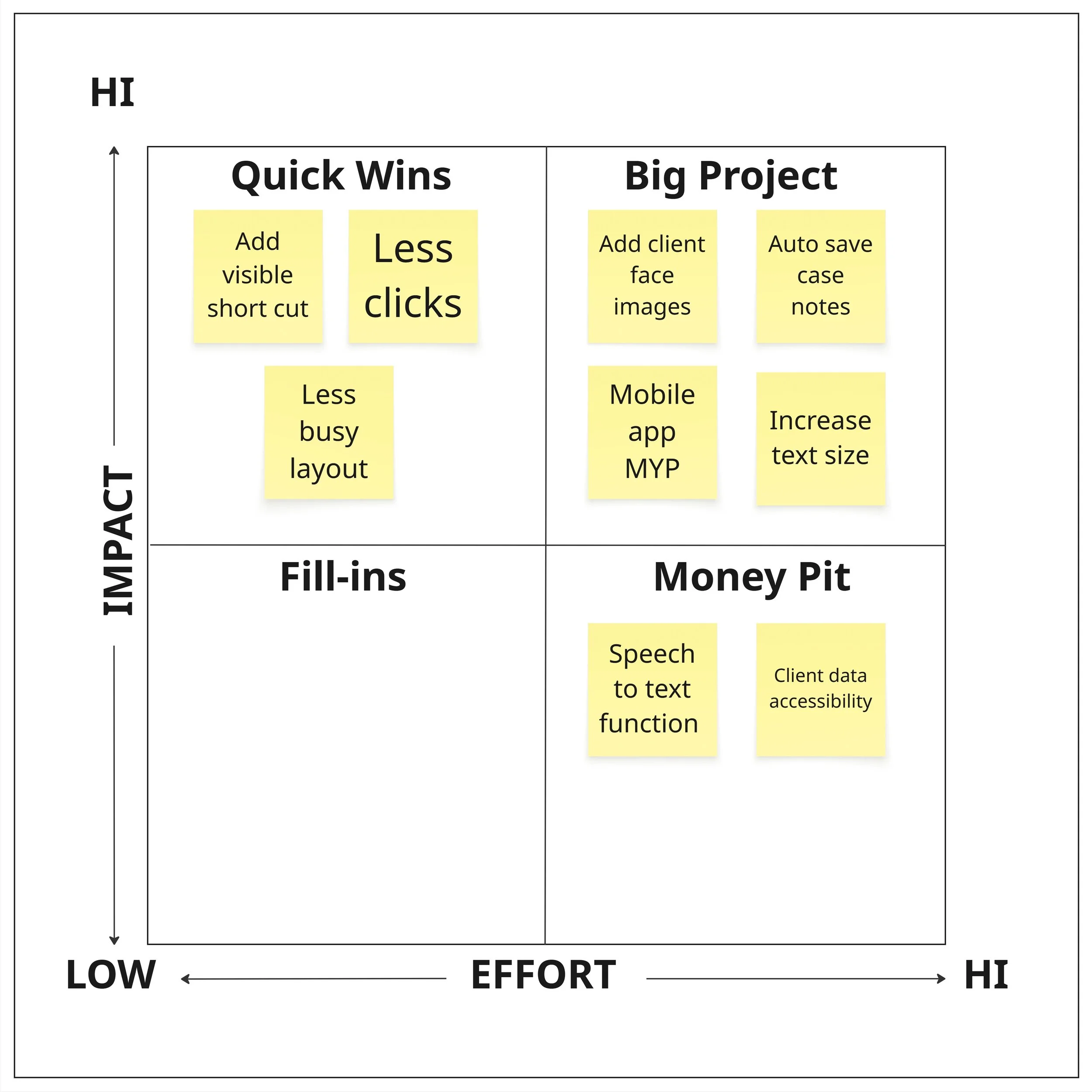
Impact VS Effort Matrix
To prioritise the design concepts, I plotted each idea against its potential impact and the effort required to implement it. This helped identify which changes would deliver the most value to support workers in the shortest time.
Prioritising the Changes
Quick Wins — High Impact, Low Effort
-Fix these first
Better navigation to case notes
Introduced a shortcut menu for
support workers' everyday essentials
To less confusing lay out
Major Projects — High Impact, High Effort
-Plan carefully
Auto-save case notes
Add client profile photos
Increase text size
Do Later — High Impact, Highest Effort
-Requires more resources
Speech-to-text functionality
Client data accessibility
Why this order?
The Quick Wins are mostly visual and structural changes. They don't require major system rebuilding but would immediately make a noticeable difference to support workers every day.
The Major Projects need more design and development work, but are still focused on improving the core support worker experience.
The Do Later items are more complex. Speech-to-text requires technical integration, and client data accessibility connects to the wider admin improvements planned for Phase 2.
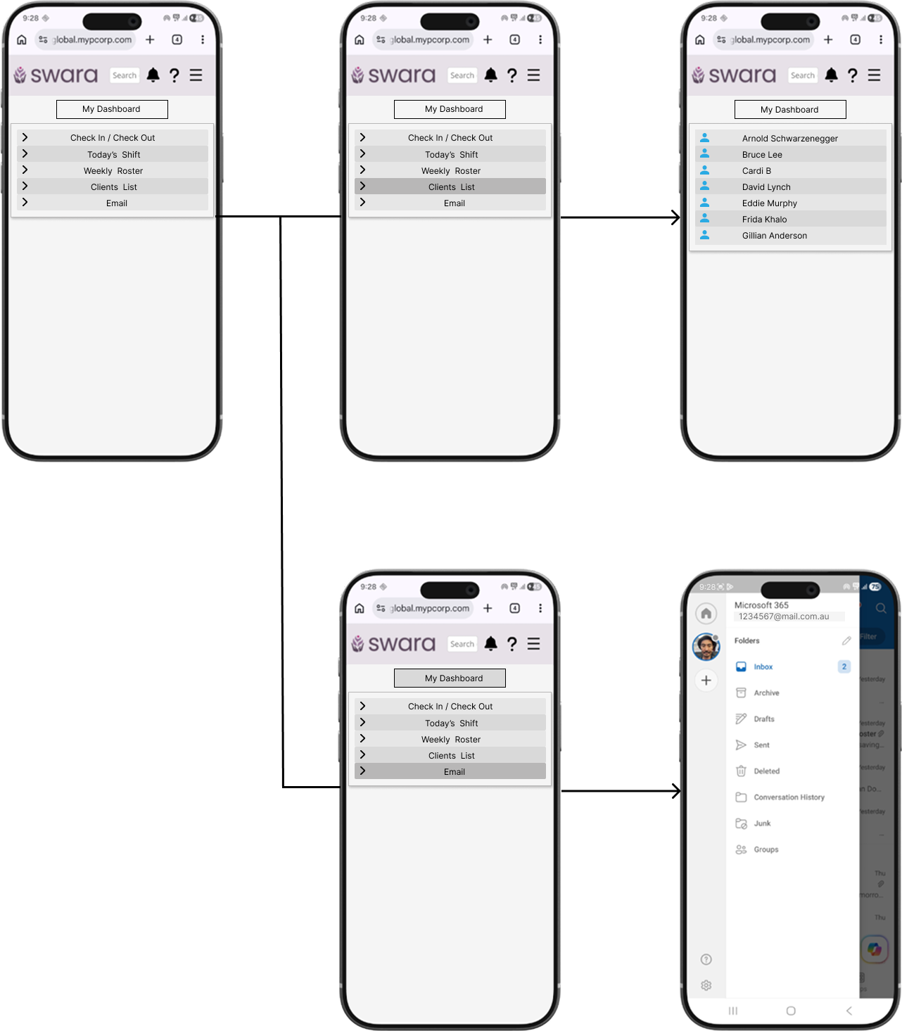
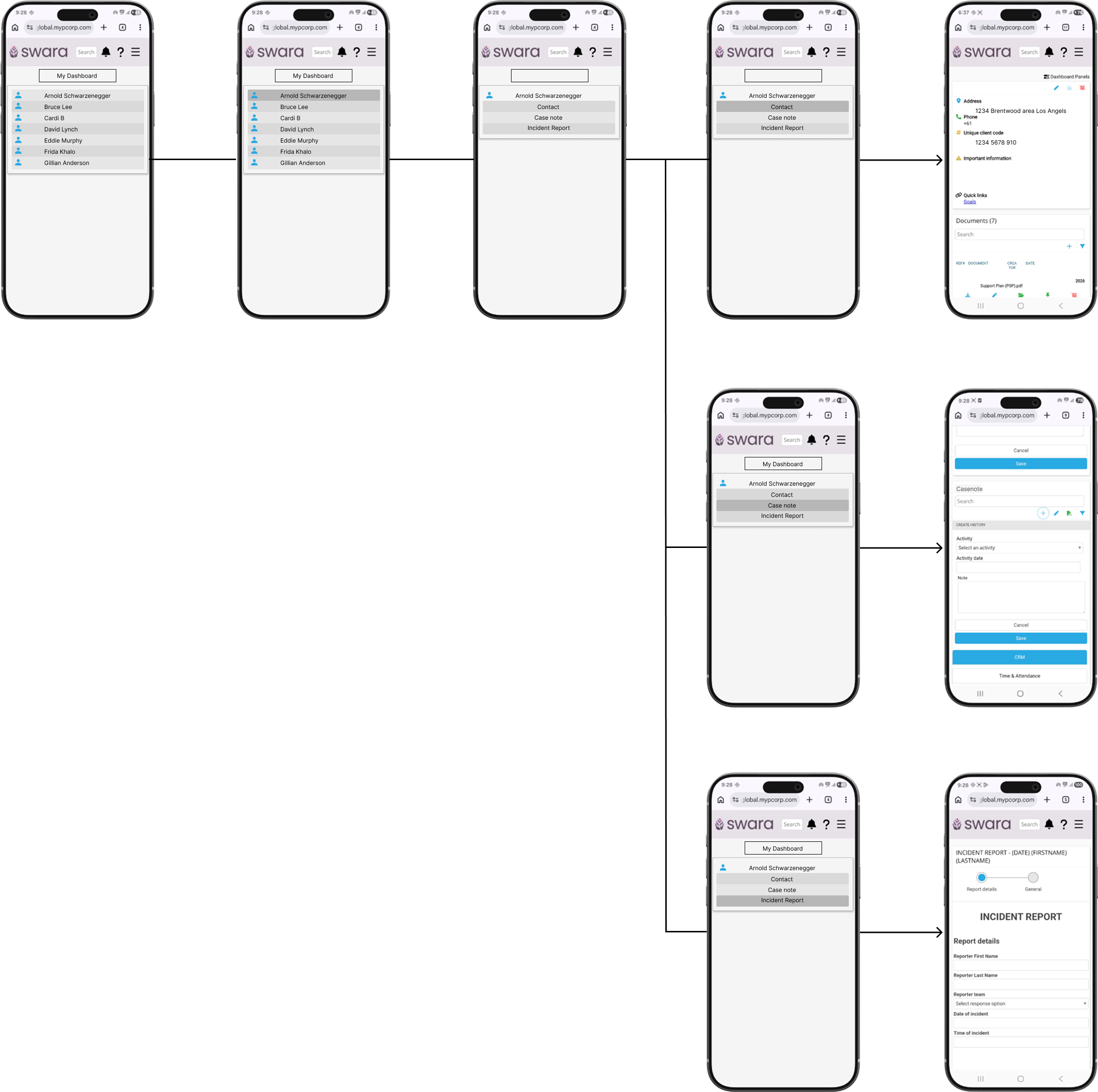
Wireframes
Research showed that support workers struggled to access case notes because the MYP landing page was cluttered with information unrelated to their daily tasks. With no direct path from the search bar or menu, users often had to navigate through multiple screens and manually search for clients, creating unnecessary friction in their workflow.
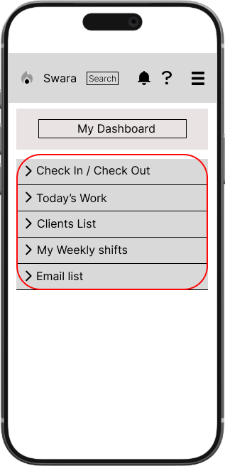
To improve findability and efficiency, I redesigned the information hierarchy and introduced My Dashboard as a single entry point for the most frequently used tasks. This brings together the links support workers rely on most in one place, reducing the need to navigate through multiple screens or manually search for a client just to reach the case note section
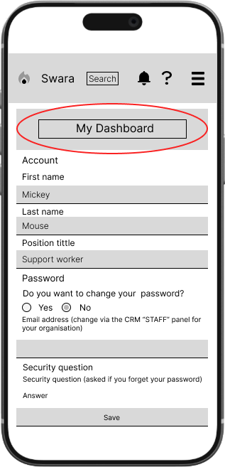
Once users enter My Dashboard, key links are grouped into a simple consolidated list, reducing the number of clicks required and improving ease of access.
Wireframes Work Flow
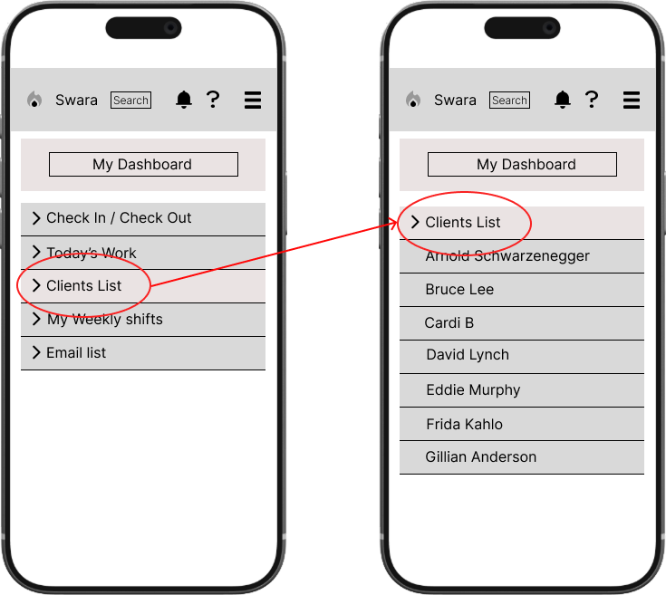
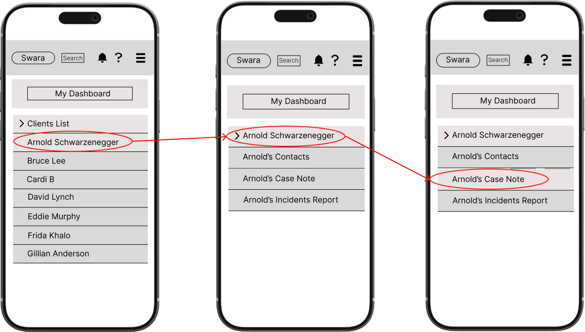
Merged scattered links into a single dashboard for faster access
Renamed confusing titles to clearer, more direct labels
Streamlined navigation so users can find the case note, daily shift, and weekly shift sections without searching
What the Redesign Addressed
Design Process
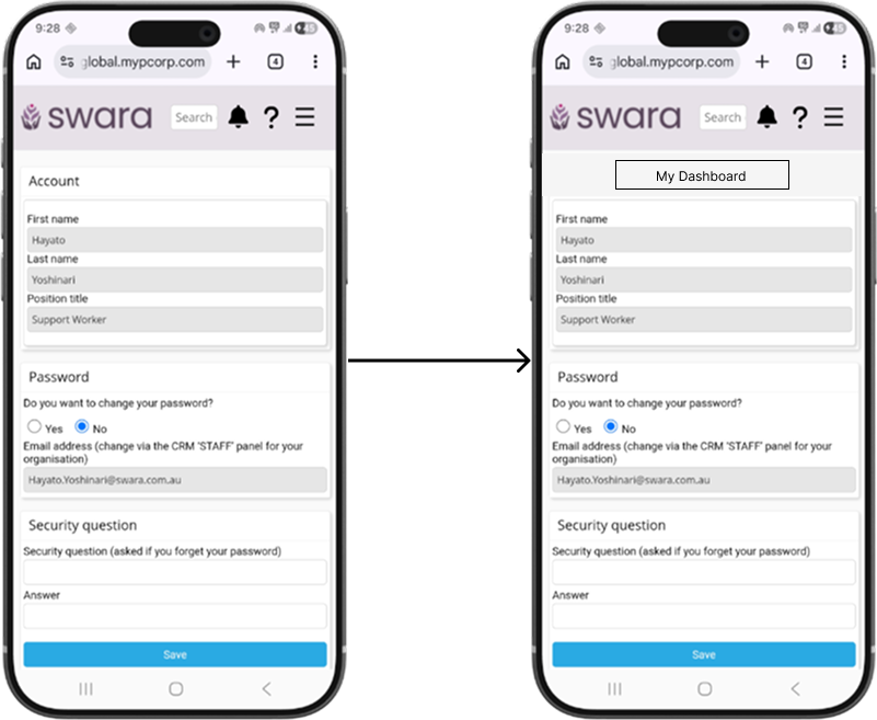
Prototype - Landing Page Before After
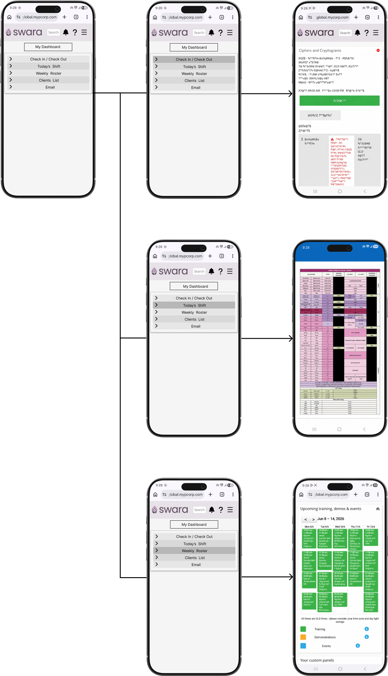
Prototype - My Dashboard menu workflow
Usability testing & findings
"Were there any links or labels that felt confusing or unclear? No, it was awesome."
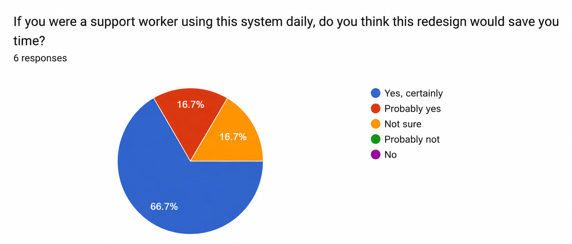
Six colleagues tested the prototype over two days. Navigation scored 4.67/5, all participants located the Case Note section, and five out of six rated it much better than the current MYP system. No confusing labels were reported.
In the observed session, participants took around 20–30 seconds to find My Dashboard on first attempt. Three things worked against them at once: they defaulted to the search bar out of habit, inactive prototype links made the interface feel broken, and the unchanged client search flow made the redesign feel less different than it was.
This is the natural friction of introducing a new structure into a habitual workflow, not a failure of the design itself. A first-time onboarding callout pointing users to My Dashboard would ease that transition for real users.
What I learned
This was my first independent case study, and it gave me a valuable insight into how to extract meaningful data from users. It also showed me how much that process shapes the direction of the entire project.
Initially, I prioritised closed-ended questions in the user test survey to minimise drop-off rates and keep completion times short. As it turned out, this meant I missed out on deeper qualitative insight. To fill that gap, I followed up with in-person user testing sessions, which gave me the depth of understanding the survey alone couldn't capture.
Reducing the steps it takes to complete a case note showed that small organisational changes can dramatically improve the everyday experience. You don't always need to rebuild a system from scratch.
This project reinforced that UX design is never truly finished. It's a continuous cycle of feedback and improvement. While I was able to redesign key parts of the system, the next step would be to conduct proper usability testing to validate the changes and uncover anything I may have missed.
What’s Next?
Testing revealed two design gaps to address in the next iteration:
No in-screen back navigation — users exiting via the phone's back button confirmed a visible back button or breadcrumb navigation is needed for mobile
A first-use prompt pointing to My Dashboard would reduce the initial hesitation observed during testing
This case study covered Phase 1 — the support worker experience. Here's what comes next:
Phase 2will focus on the admin side of the system, addressing more complex issues including document management, shift notifications, and confidentiality risks
Many of the admin problems are tied to deeper technical limitations that will require a dedicated development team to resolve properly